Intranet Design: 5 Practices That Build A Mobile-First Experience
13-Apr-2022
2:13 pm
A successful intranet design is not only about implementing the correct color schemes, typography, logos, and other brand elements of your company. Though these elements are necessary, intranet design is not limited to them.
Creating a responsive design should top your design checklist. That’s because half of the web traffic engages through mobile devices, implying that the days of desktops will be numbered soon. So, it’s essential to have a responsive intranet design both for mobile and laptop users.
Below we list the list of important principles of mobile intranet design.
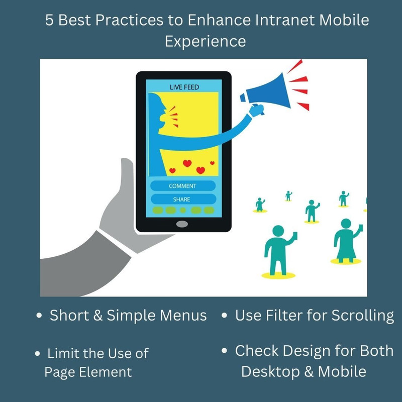
It is essential to format content into smaller paragraphs and shorter sentences, rather than having huge blocks requiring multiple scrolls on mobile devices. So, when you are sharing news with employees, asking them to fill out online forms, or sharing some knowledge, Creative Social Intranet ensures that the following are in place:
Easy-to-digest intranet material isn’t simply a recommended practice for mobile intranets. Instead, it should be applied to your whole digital workplace.
The dashboard has to be clean and free from any clutter. So, you need to ensure that the menu doesn’t eat up significant space that distracts the users’ attention. Creative Social Intranet has designed the intranet with responsive menus that automatically collapse into “hamburger” menus when a user accesses the intranet from a mobile device.
Space is limited on mobile screens, so don’t waste it on extensive menus that divert attention away from the content that matters the most.
Not all traditional page elements are useful. Whilst menus, shortcuts, bookmarks, and search bars form the basics of an intranet UI, you can limit its usage so that users are not distracted from the main content. Some elements like a homepage link, notification bars, and main menu are essential items that ease navigation for users and should be used inevitably.
Creative Social Intranet makes smart use of filters that will allow users to narrow down their search and view only the content that’s important to them, saving them scrolls and time. So, if users want to search an article for a specific topic, they can add a filter to return results with that specific tag. This helps in avoiding numerous scrolls to find a relevant blog post.
Creative Social Intranet strongly advocates that you check your work on both device types before hitting the publish button. This will avoid any mishaps before going live, save time and costs, and ensure a steady user experience across devices.
Designing your new intranet site for mobile devices has its own set of best practices, not least because you’ll be working with a considerably smaller screen size that will limit space. As a strategy, keep this in mind while planning your intranet implementation, and allocate extra time to optimize your intranet design for mobile use.
ENGAGEMENT DRIVE PERFORMANCE